
In today’s data-driven world, donut charts have emerged as an effective tool to visualize data in an engaging and easy-to-understand way. However, understanding one requires knowing how to read a donut chart and how to assess its elements. In this article, we will delve into the structure and functions of a donut chart and provide some tips on how to interpret its data efficiently and accurately.
Understanding the Basics of a Donut Chart
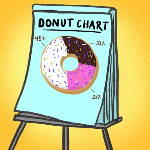
A donut chart is a circular graphical representation that exhibits the proportions of parts to the whole. It resembles a pie chart but unlike the latter, it features a hole in the center, imitating the shape of a donut, hence the name.
The value of each segment of the donut chart equates proportionally to the quantity it represents. The color-coded data labels offer a simplistic view of diverse categories of the data set. Each separate color in the chart represents a unique category.
Most users employ donut charts to present population types, survey data, or percentages. They can exhibit multiple data series, and their simplicity allows for quick comprehension of the data.
Relativity is a significant factor in donut charts. In reading it, one can observe easily the differences in data series. However, one critical thing to note is that donut charts are less effective when used for data sets that contain more than six categories because they can become too complicated to interpret.
Essential Elements of a Donut Chart
Generally, donut charts come with three main elements: the donut hole, the rings, and the legend. The donut hole, located at the center of the chart, may contain a total count or label. The rings represent the data series and are sequentially placed around the hole, with each colored differently.
The labeling for each ring usually lies outside the donut chart or within the legend. Each ring’s width showcases the series’ value compared with the other series. The legend, typically located on one side of the chart, guides the user in identifying what each color represents.
While the design might seem simplistic, reading and interpreting these charts must be executed accurately to ensure correct data perception. Misreading or ignoring any of the elements can lead to misinterpretation of the data.
Step-by-Step Guide on How To Read a Donut Chart
Reading a donut chart is a relatively straightforward process. It begins with a comprehension of each component: the rings and the legend. By identifying the color and size of each data segment, one can see the representation of each data category.
Start by looking at the size of each ring. The larger the ring, the higher the value it represents. Next, refer to the legend for the identification of each category. The legend aligns each color to its corresponding category.
Further, in many cases, the center of the donut (the hole) may encompass a total count or percentage or some additional informational text. This central area can be used for interpretation of the overall data picture.
Finally, take note of the relationships between the various rings. The main idea of donut charts is to portray a sense of relativity. One can apply relevant comparisons between the data segments or observe relative proportions.
Overall, donut charts are a valuable tool for visual data representation. By familiarizing yourself with the structure of a donut chart and understanding how to read it accurately, you can make effective use of this versatile data visualization tool.


